
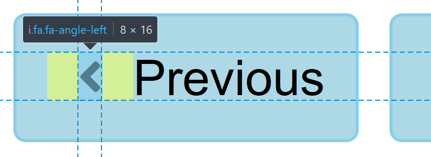
Surprisingly, this is the solution used by OutSystems UI, the modern UI framework for the OutSystems low-code platform. The buttons with icons just seem unbalanced to me. Can we do better than that?
Adding special classes to the parent button
I’m sure this solution is quite obvious. Just add a few classes on the button: .btn.icon-left for left-aligned icons, and .btn.icon-right for right-aligned icons.
Much better! But it requires changing the class of every button that uses icons.
Thinking back to OutSystems UI, lots of developers are already using buttons with icons inside of them, but they have never been instructed to use these special classes according to the icon alignment. They will definitely not go back and change every button according to these new guidelines.
Maybe we could keep the existing behavior as the default, despite the unbalanced margins, and rely on developers adding the new classes if they want to adjust their buttons.
Maybe we could inject these new classes through JavaScript.
But that’s not what I wanted to do. I wanted to prove that CSS alone had the tools to handle this seemingly simple use case.
Some failed attempts
Why :first-child and :last-child don’t work
So, we want to add a margin-right to an icon, but only if it precedes the text. Why don’t we try something that uses a :first-child selector, which will only match if the icon is the first child of the button? The other case of an icon succeeding the text is very similar, we can just use :last-child for that.
Well, it didn’t work. Upon inspection, it seems that every icon in this example matches both :first-child and :last-child, despite some of the icons being surrounded by text. Seems odd? Not really.
Just remind that the text surrounding the icons are not DOM elements. Now it should be clear why the icons match :first-child and :last-child: because, in fact, they are the first and last child — if we only consider DOM elements!
The ghostly text nodes
The CSS specification makes it really hard to have different behavior depending on the presence or absence of text nodes. They are elusive creatures in the world of CSS, kind of like a ghost. Every attempt to match them will fail, just like every attempt at identifying ghosts.
And that’s the only reason why this problem turned out so complex. If we were to just enclose the text into a span, the :first-child and :last-child solution would have worked.
There are just a handful of selectors that will behave differently in the presence or absence of text nodes. These selectors don’t seem to be useful to this problem in particular (believe me, I tried to exploit them), but here they are for reference:
:emptywill only match if the element is empty. If the element has a text node as a child, it will not match. However, it cannot distinguish between having a text node or an element as its children.::first-letterwill match the first letter of the text node… but only if it’s the first child… or something like that. The complete rules are a lot more complex than that.
Some satisfying solutions
Finally, there’s a use for word-spacing
Put two inline elements next to each other, neither of them having any white spaces. For example: sometext. These two tags will be considered as a single word by the browser.
Now here’s a trick: we can inject a white space in the ::after pseudo-element of the first inline element, and this will guarantee that they are considered two separate words.
And here’s another trick: we can use the word-spacing property to change how much space separates those words.
Now imagine that the first inline element is the icon, and the second is the anonymous inline box generated by the text node. We can target the icon and inject the white space using ::after, and control the width of said space using word-spacing. And that’s all we need!
But it gets even better! If the white space introduced turns out to be at the end of the element, for example if the icon is aligned to the right, then the white space is ignored! This makes sure that the icon only receives the margin if followed by text.
There’s just one problem. Font Awesome is already using the content property on the ::before pseudo-element. If we try to add a white space on ::before, to separate the right-aligned icon from its preceding text, the icon will disappear entirely. The demo above works around this problem by adding a white space to the original content property of every icon used. An exhaustive list of Font Awesome icons would need more than 600 similar rules.
Note, however, that some other icon fonts might not have the same problem. For example, Material Icons uses ligatures to render its icons, which leaves ::before and ::after untouched. In this case, the method works remarkably well.
Using inline-table
Another trick up our sleeve: tables will automatically create anonymous cells when they find a text node lying around without a parent cell. These are still not a DOM element, but they are laid out visually as if they were.
We can use this to our advantage: by making each button be an inline-table, we can turn icons into a table-cell, and the text will naturally become an anonymous cell. Buttons containing icons and text will have two cells. Buttons with just a single icon, or just text, will have a single cell.
But remember, we still can’t target the text node, or be influenced by its presence or absence. What we can do instead, is add spacing around all cells with border-spacing. And this will also be applied to the anonymous cells.
Note that the border-spacing changes the spacing in between cells, but also adds the same spacing at the edges of the table. For that reason, we must reduce the button’s padding appropriately. This also means that the visual padding on the button, which is really being emulated by the border-spacing, needs to be the same or bigger than the spacing between the icon and the text. For example, it’s not possible to increase the icon spacing on the demo above without also increasing the visual padding of the button.
Using inline-grid
After understanding the inline-table approach, it should be fairly simple to modify it to use inline-grid. Just like on tables, grids also create anonymous grid items for text nodes, so the working principle is the same.
This time, with inline-grid, it is possible to change the spacing between grid items, without having the same spacing being applied at the edges of the grid. So there’s no need to adjust the button’s padding. The property we need to use is grid-gap, and here’s a demo:
Conclusion
We have seen three solutions to automatically adjust how icons are placed inside a button, based on which side of the icon there’s text. How do they compare?
The word-spacing solution works across all browsers, and looks like the safest option to me, since it doesn’t rely on overriding the display of the button. It has one big drawback if using Font Awesome, or any icon font that uses either ::after or ::before pseudo-elements. Fixing this problem requires one CSS rule for every icon, adding a white space to its original content property. It may also suffer from relying on an unusual technique, and therefore not so easy to be understood. You might have to link to this article, if you ever use it!
The inline-table solution also works in all browsers, but adds a little more risk because it changes the display property of the button. If the button has other children besides the icon and text, those other children might behave slightly differently due to the inline-table parent. However, I could not come up with any scenario where this would be a problem.
Regarding the inline-grid, besides changing the display of the button, it has no support from Internet Explorer due to the use of the grid-gap property.

Leonardo Fernandes Head of Delivery Connect with Leonardo via LinkedIn